SEDUCTIVE SUBVERSION
US Art Historian Prof Paula Burleigh writes about Susanne Kamps painting, 2020
Seductive Subversion: Susanne Kamps' Interior Views
By Prof Paula Burleigh, Ph.D.
The work of Susanne Kamps is unabashedly maximalist: boldly colored, kaleidoscopic configurations of texture and pattern transform everyday interiors into intriguing spatial puzzles. The artist has described her work as a “tapestry of textures,” which aptly characterizes her predilection for sumptuous surface designs, particularly of textiles. Critics and historians have noted Kamps’ fidelity to the flattened perspectives and saturated palette of Henri Matisse and the Fauves, the early 20th century French experimentalists with color. But other more recent historical precedents are just as relevant: Kamps is in dialogue with Wayne Thiebaud’s joyful cake and pie paintings, and her hallucinatory palette and dizzying array of perspectives pay homage to the work of David Hockney. In subject matter, Kamps gravitates towards variations of the still life, delighting in ordinary views of furniture, drinking vessels, food, and table tops. She taps into a venerable tradition of artists—Paul Cézanne, Pablo Picasso—who took the greatest formal risks with the most quotidian objects. Indeed, while Kamps’ paintings are legible as lush interiors, they also periodically dissolve into pure passages of color and form, often revealing multiple perspectives knit together into a single composition. But in addition to myriad art historical references, Kamps’ practice displays a contemporary sensibility that is all her own. In this essay, I explore the ways in which Kamps works within various historical legacies in order to update and even subvert them through her engagement with themes of gender, Camp, and ritual.
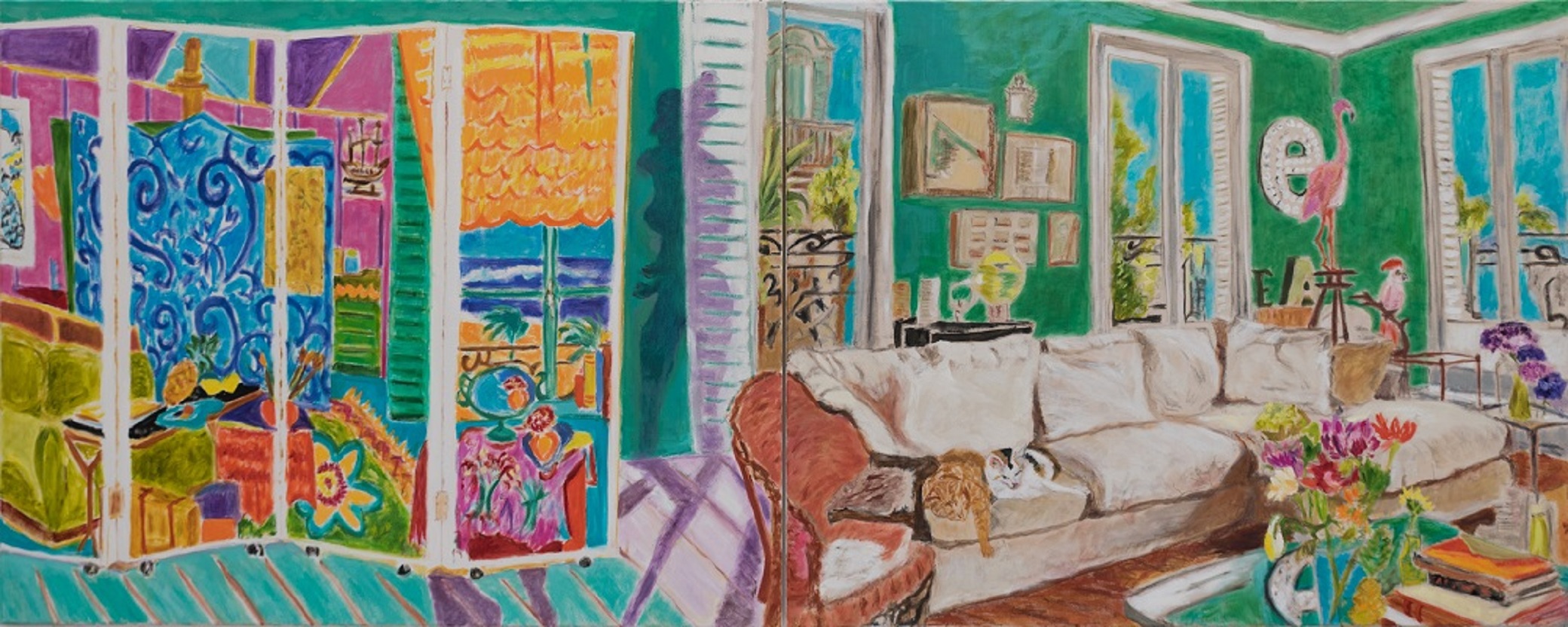
The large-scale, panoramic composition Behind the Screen (2019) encapsulates key themes that recur throughout the artist’s oeuvre. On one side of the diptych, the light-filled living room of Kamps’ Paris apartment opens onto tantalizing fragments of cerulean blue skies. The opposite panel displays a floor-to-ceiling, painted folding screen. Familiar still life elements—flowers, vases, books—populate the living room, alongside more vernacular decorative objects, including a large flamingo figurine and the letter e mounted on the wall. Two cats—Seraphine and Carry—sleep peacefully on an eggshell colored couch. While the painterly brushwork and jewel-toned palette echo early twentieth century Fauvist aesthetics, anecdotal details—the flamingo and neighboring cockatoo, the mounted letter, the decidedly contemporary sofa—anchor the space in a recognizably current moment. Such design flourishes provocatively engage questions of taste and kitsch, boundaries the artist pushes even further with the painted screen. In the history of Western art, critics often relegated painted screens to the marginal arena of design, a category subservient to painting and sculpture. Rejecting these artificial hierarchies, Kamps embraces the domestic sphere and its attendant bric-à-brac. Indeed, much of her work explores the private spaces that individuals curate for their own solace and joy.
Kamps’ interest in design and domestic interiors raises questions concerning the largely unremarked upon role of gender in her work. Kamps’ art historical sampling comes entirely from men, a reality dictated by the systemic inequalities which made education and exhibition opportunities far less available to women. Kamps borrows select aesthetic sensibilities of her male artist forebears, but then suffuses the resulting compositions with content that questions conventional gender norms. Her focus on the domestic interior is far from neutral, but the exploration of a space historically coded as feminine.
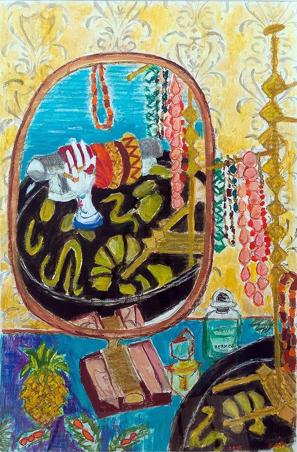
The painting Belle Epoque (2015) brings the viewer into intimate proximity with a mirror atop a vanity, sitting next to jewelry and perfume bottles. Where we should see ourselves in the mirror, there is only a disembodied hand-shaped ring stand, floating on a sinuously patterned textile in front of bracelets on a rack. Regardless of the viewer’s gender, Belle Epoque puts the audience in the position of performing feminine self-presentation, engaging in a ritual of adornment.
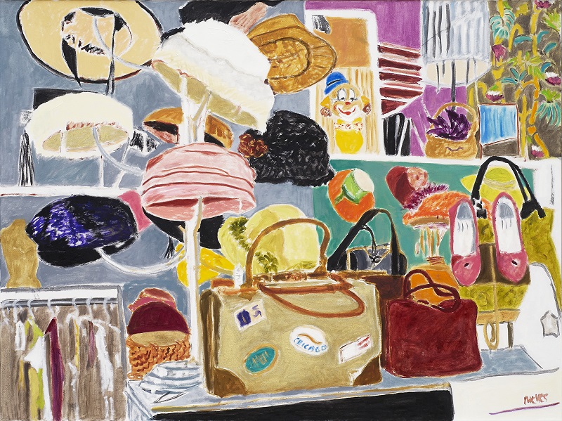
Elsewhere, as in Fortnum & Mason (2017) and Vintage Shop (2018), the viewer becomes a shopper, admiring window displays of hats, shoes, women’s bags, or an elaborate tea setting bedecked with impeccably decorated sweets. These are stylish worlds, distinctly feminine and occasionally bordering on the concept of Camp.
Notoriously difficult to define, Camp is an aesthetic sensibility that unapologetically revels in style, fun, and excess, dwelling somewhere between so-called good and bad taste. Ultimately, Camp questions the very existence of categories like “good” and “bad.” The American writer Susan Sontag wrote what remains the most well-known essay on Camp in 1964. There, in “Notes on Camp,” Sontag defines Camp as “a mode of seduction,” which she goes on to describe as “[a] spirit of extravagance. Camp is a woman walking around in a dress made of three million feathers.”
Kamps does not show us that woman: the viewer becomes that woman, navigating her fabulous environs. Even the great champions of the still life such, from Chardin to Picasso, would not have included some of the objects Kamps routinely depicts—to do so would have been to veer into feminine territory, historically regarded as frivolous. But Camp (and Kamps) rejects outmoded gender-based hierarchies. Instead, she lavishes attention on wallpaper, window shop displays, and textiles. In this way, Kamps explores themes of design, consumption, and fashion to radically update—even upend—the masculine legacy of the French avant-garde painters.
But this is not the whole story: returning to Behind the Screen, we can discern influences beyond the French avant-garde. While the folding screen was often dismissed as an insubstantial design object in the Western tradition, it occupies a central position in the history of Japanese art, an important source of inspiration for Kamps. The flat, graphic quality of her painting reflects aesthetic conventions common to Japanese prints of the eighteenth and nineteenth centuries—shallow space, clearly outlined forms, and the absence of shadows—formal devices that likewise inspired many European artists. Perhaps Kamps’ assimilation of various cultural influences explains why she has never been beholden to staid Western conventions of single-point perspective or illusionistic space.
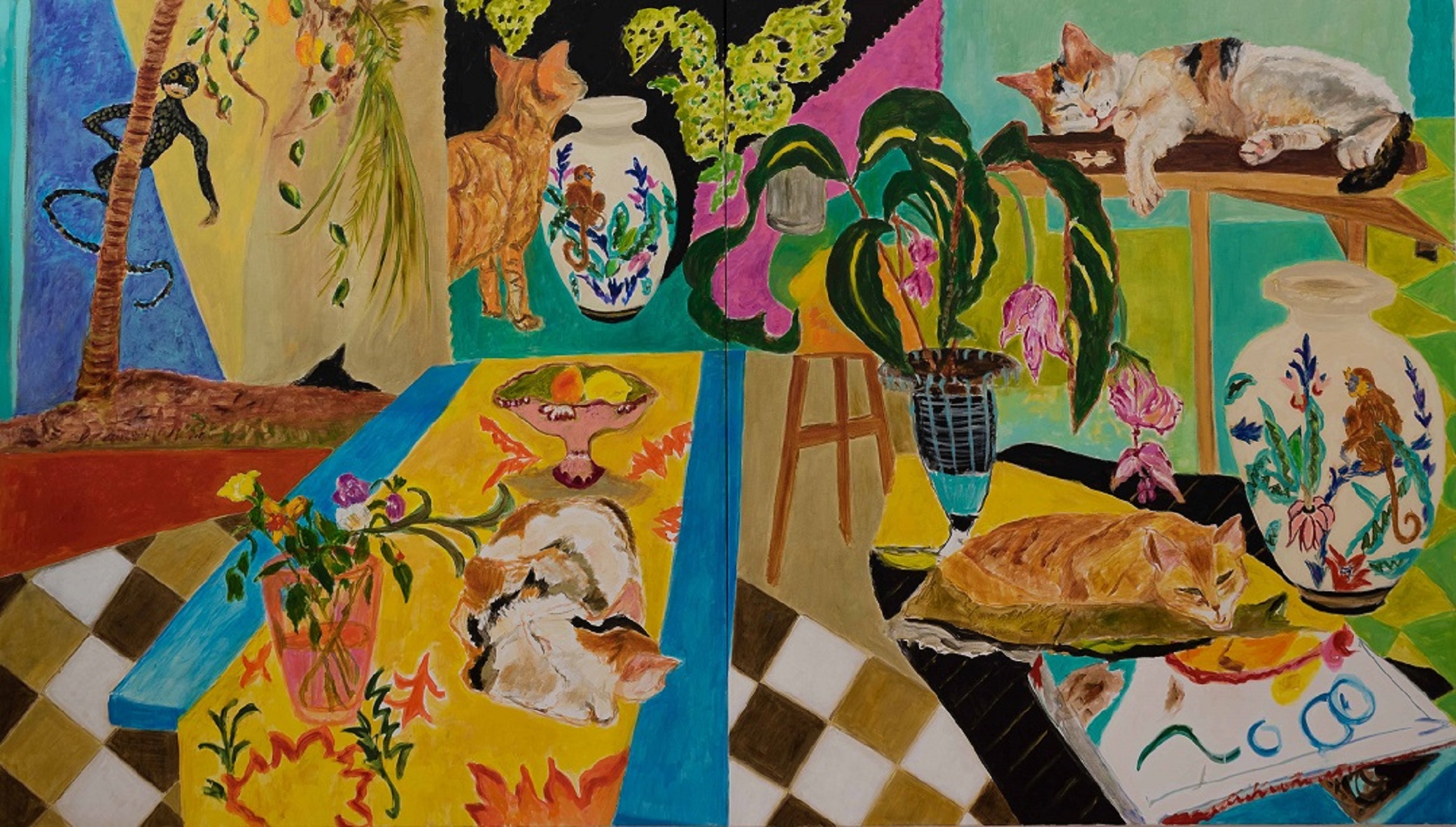
A large interior titled Cat Days (2017) illustrates not only the artist’s experimentation with space and perspective, but time. While the composition is legible as a kitchen inhabited by lounging felines, under scrutiny, the space breaks down into a Cubist juxtaposition of disparate perspectives. The implied viewer is in motion, and the composition revolves around its own mysterious inner logic. Unmoored, the viewer floats above checkered floor tiles that would collide discordantly were they not covered with a long blue table. A wooden stool appears much further away than the shallow space should allow. A mischievous sprite peers out at the viewer from behind an ambiguously situated plant, inviting us to parse this visual puzzle. Notably, four cats are visible but in only two patterns, suggesting that the scene unfolds over time. While the multiple perspectives nod to Cézanne and Picasso, the bold outlines and continuous narrative are more in line with a Japanese tradition—perhaps subtly referenced in the patterned vases (a recent Ebay purchase by the artist), which look like Japanese lacquerware.
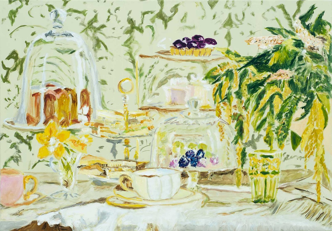
The Japanese influence extends beyond space and time. Japanese folding screens, like the one featured in Behind the Screen, served as backdrops for rituals, from the tea ceremony to dance performances. While the human figure appears sparingly in Kamps’ work, there is ample evidence of the body’s movements, actions, and desires. In the form of macarons, tarts, and cakes, promises of gustatory delights abound. Elaborately appointed tabletops and tea sets suggest that the artist is less interested in the food itself than the ceremony of its consumption. Indeed, while painting inherently lends itself to sight, the content gestures toward multi-sensory experience of other kinds: the pleasures of eating and drinking, the aroma of perfume, even sound in the form of sheet music. Kamps’ compositions celebrate excess: they are colorful mélanges that pay homage to the joys of sensorial experience, the best of life’s fleeting, time-bound pleasures. It is no surprise that cats—the most decadent domestics—are among the few living creatures that inhabit the paintings.

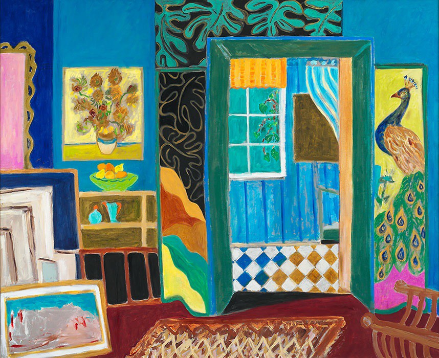
Above all, Kamps’ work is an idiosyncratic visual language that moves seamlessly lived experience and a graphic world of color and line. In Notting Hill (2010), a painting based on the London flat that the artist shares with her husband, Kamps represented a visit to a Van Gogh exhibition at the British Museum with a poster of Van Gogh’s sunflowers on the wall (in actuality, the image existed on the cover of a purchased exhibition catalogue). She rendered the sighting of an actual peacock in Holland Park as a splendid painted bird flanking a doorway, reminiscent of a motif from Whistler’s Peacock Room (1877). The viewer can make out only the blank backs of several frames stacked against the wall, suggesting additional memories, experiences, and influences, all waiting to be translated into visual ciphers. Returning to Behind the Screen one last time, Kamps’ folding screen is more than a design object and a mainstay of Japanese art history; it is also a painting within a painting, quoting an actual folding screen—Paravan No. 3 (2004)— that Kamps painted in the style of Matisse. It is easy to get lost in this intricate labyrinth that traverses nimbly between the real object and the flat composition, between the past and the present. It is a pleasurable, albeit dizzying journey.
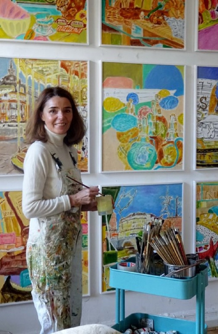
A photograph of the artist in her atelier standing in front nine small oils arranged in a tight grid emphasizes the way in which the paintings participate in an ongoing conversation. Indeed, Kamps considers this collection a single work depicting nine views of Paris, and she has made other similarly configured works—nine views of Japan, nine views of Ghana--that function almost like installations. Chalk full of references, the photograph reads like one of her paintings: visually decadent, an immersive world of colors, scenes, and perspectives, woven together into a vision that is recognizable but constructed according to rules that are Kamps’ alone.
Paula Burleigh, PhD
Meadville, Pennsylvania USA
August 2020
About Paula Burleigh
Paula Burleigh is the director of the Allegheny Art Galleries, and Assistant Professor of Art History at Allegheny College in Meadville, Pennsylvania. Burleigh has a PhD in Art History from the Graduate Center of the City University of New York. Burleigh has been a Joan Tisch Teaching Fellow at the Whitney Museum of American Art, New York; and a lecturer at the Museum of Modern Art, New York. Her writing has appeared in the Brooklyn Rail, Artforum.com, Stedelijk Studies, Art Journal, and in various edited volumes. Click on the link to learn more about Paula: https://sites.allegheny.edu/directory/employees/burleigh-paula/